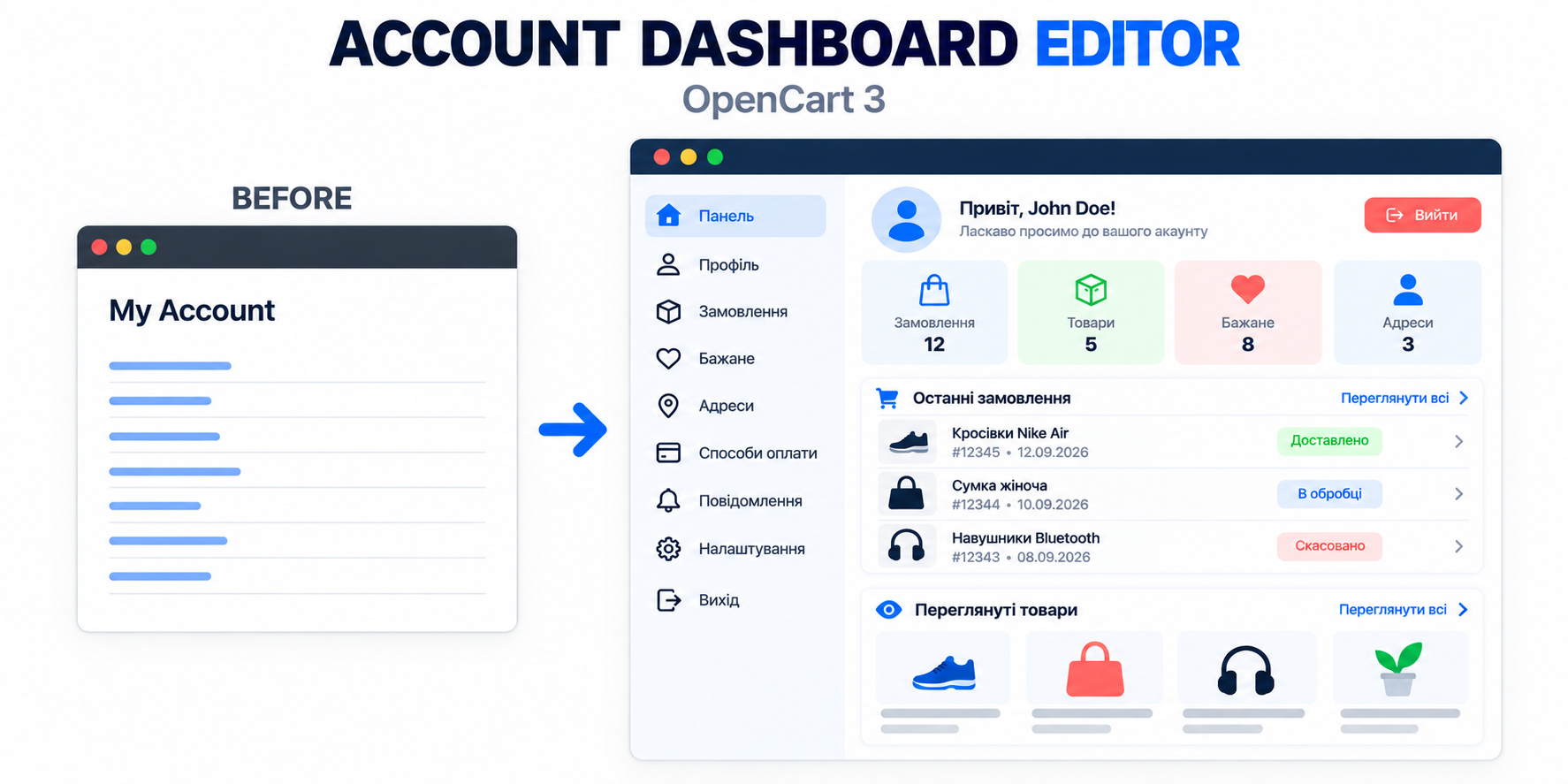
A personal cabinet is often perceived as a technical section that is simply enough to configure. In fact, it is one of the key points of interaction with a regular customer. This is where a person checks orders, repeats purchases, changes addresses, or seeks help.
The standard OpenCart cabinet performs basic functions, but its structure does not always correspond to real user scenarios. Important actions get lost among secondary ones, and the main page often looks like a simple list of links.
Improvement does not necessarily mean a complete redesign of the template. First, it is worth understanding why the customer opens the cabinet and shortening the path to the needed action.
Start with real scenarios
In most stores, a user enters the personal cabinet for several specific actions:
- Check the order - see the current status, composition of the purchase, amount, and delivery method.
- Repeat purchase - quickly return needed items to the cart without searching again.
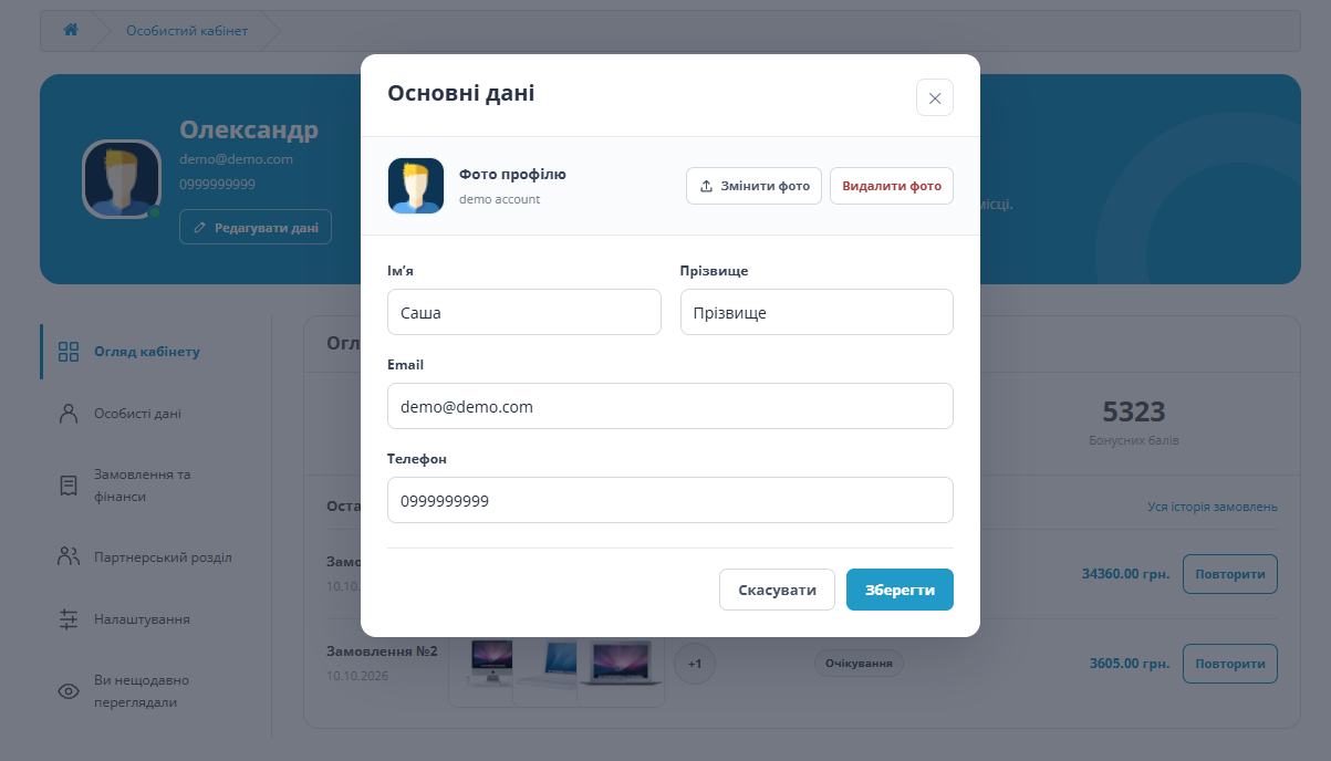
- Update data - change contact information, password, or delivery address.
- Solve a problem - find returns, warranty, support, or answers regarding an order.
If these actions are not visible immediately, the cabinet formally works, but creates unnecessary burden. The user has to read all menu items, go back, or contact a manager.
What to improve first
1. Clear main page
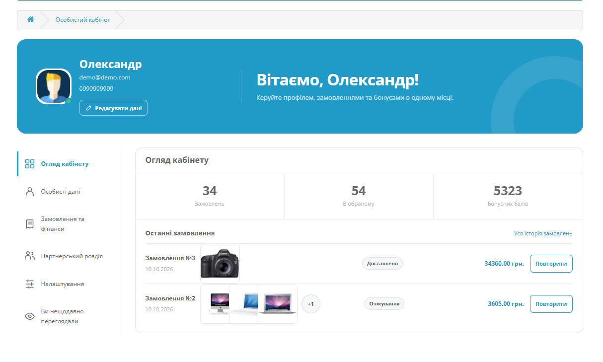
After login, the customer should see shortly and clearly the last order and main actions. There is no need to display everything that exists in the system on the first screen. It is better to leave 4-6 truly useful items and move the rest to an additional menu.
The most important block is the last order. It is useful to show the number, date, amount, current status, and a button to go to details. If there are no orders yet, instead of an empty table, it is more appropriate to offer to go to the catalog.
2. Priorities in navigation
"Order history," "Addresses," and "Personal data" are usually needed more often than downloads or bonus operations. They should be more noticeable. The names of menu items should be short and unambiguous.
3. Useful order history
The order list should help, not just keep records. In addition to the number and date, it is worth showing the status, amount, main items, and available actions. For stores with regular purchases, a reorder button is especially useful.
Status messages should be formulated in the customer's language. For example, "Preparing for shipment" is more understandable than an internal service name. If possible, add a short explanation of the next step: when to expect shipment or where to find the waybill number.
4. Working with addresses
The address form should contain only the fields that the store and delivery service actually need. Unnecessary mandatory fields increase the risk of errors. If the store works with multiple delivery methods, it is useful to allow naming an address, for example "Home" or "Office," and clearly mark the default address.
5. Returns and support
A customer should not search for return rules in the website footer if they have already opened a specific order. Links to returns, warranty, and contacting support should logically be placed directly in the purchase details. It is also important to explain what will happen after clicking the button and what data needs to be prepared.
Mobile version - not a reduced copy
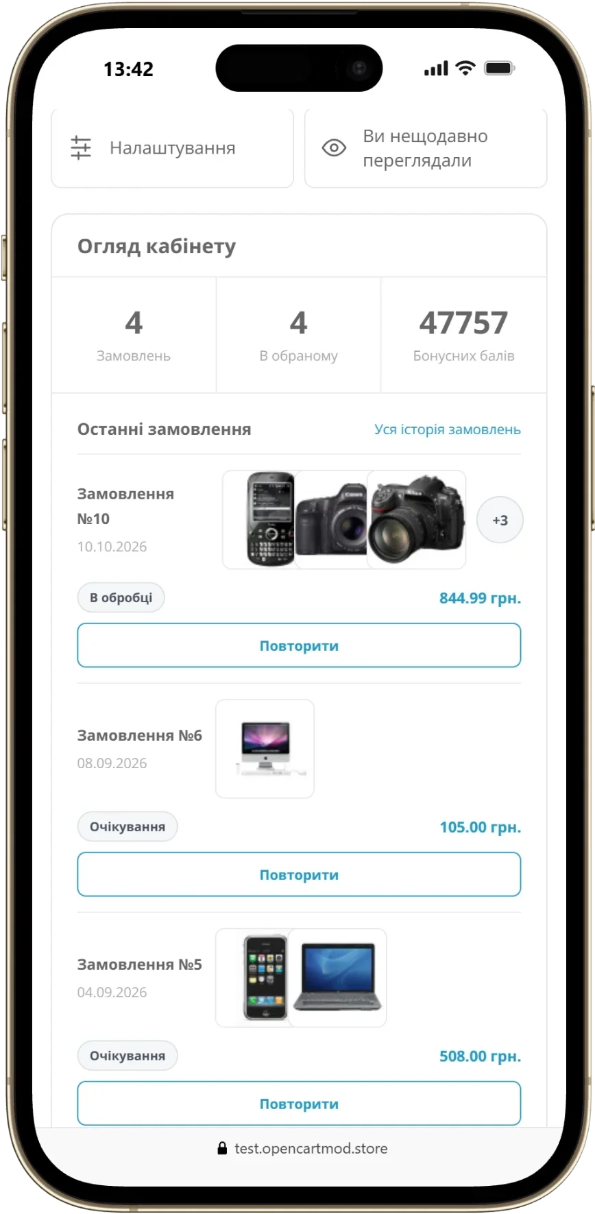
A personal cabinet is often opened from a smartphone after a notification about an order status change. Therefore, the mobile scenario needs to be checked separately.
- Buttons should be easy to tap with your finger and not be too close to each other.
- Order tables are better converted to cards rather than compressed into an unreadable format.
- The order number, status, and main action should remain visible without horizontal scrolling.
- Forms should use the appropriate keyboard type for phone, email, and numeric fields.
Speed, accessibility, and security
Convenient design does not compensate for slow loading or unclear errors. Do not overload the cabinet with heavy banners and third-party scripts. After saving the form, show clear confirmation, and place error messages next to the problematic field.
Check text contrast, focus visibility when navigating with the keyboard, and clear button labels. Actions with passwords, email, and personal data should have additional confirmation.
How to change the cabinet without unnecessary risk
It is best to start not with design, but with a small audit. Review support request records, website search queries, and pages from which users most often exit. This will show where the problem truly exists.
- List 5 most frequent actions in the personal account.
- Check how many clicks each action requires on a computer and smartphone.
- Remove duplicates and combine related items.
- Place the latest order and key buttons on the main page.
- Test the changes on several real orders with different statuses.
Short checklist before launch
- The latest order is visible immediately after login.
- Main actions have clear names.
- The account is convenient to use on a narrow screen.
- Empty sections contain a helpful tip, not an empty table.
- Order statuses are clear to the buyer.
- Returns and support are easy to find.
- After each action, the user sees a clear result.
How to understand if the changes worked
Evaluate not just the appearance. Useful metrics are the number of inquiries about order status, the share of repeat purchases through the account, form errors, and the time to complete main actions. If after the changes customers less often contact you for simple explanations and find what they need faster, the account has become more effective.